How fast can an experienced amateur paint a house? As we continue our old house remodel, we add colour, yes, colour. Join the journey!
There was one thing Kent and I agreed on – no white paint! He may have regretted that statement. He probably would have painted everything grey. Lucky for me, paint is my department.
Colour for the Old House Remodel
I find white to be a non-colour. It is a blank slate. It is nothing. Perhaps “nothing” is calming to some people. When we first moved into our little old house, it had no furniture, and everything from baseboards to ceiling was covered in shiny oil paint, straight-from-the-can-white. It was blinding. It put me off forever from white.
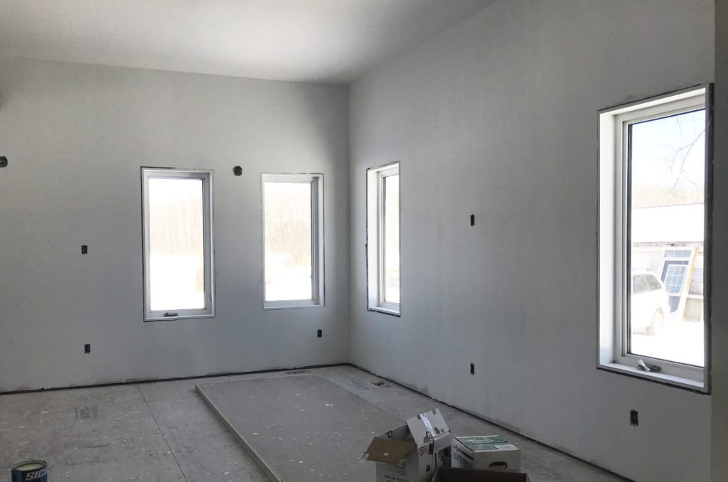
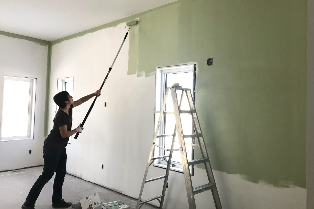
Kent and I primed the entire addition of 800 square feet twice in one weekend. We rolled the paint, no sprayers. Can you say extendable handle? Definitely a must for a ten foot ceiling, though it is still a back breaker.
With the kitchen cabinets and flooring waiting in the warehouse, the question was, how fast can you finish painting? I’ve done a fair share of painting, so, with the weekend as a buffer, I said a week. But, with no casings or baseboards to cut around, the time was about cut in half!
The kids all wanted a turn helping, so they did. I give a quick once over behind the younger ones, but they do ok already, too. And I get to stand around and sip my herbal tea, I mean, supervise, for a while.
I always get a kick out of the colour of our old living room. I painted it a mossy green when we moved in nineteen years ago (oh man, maybe it is time for a re-do), with leftover paint from a friend. But every few years, some paint company chooses a colour of the year that is pretty darn close to the colour in my living room.
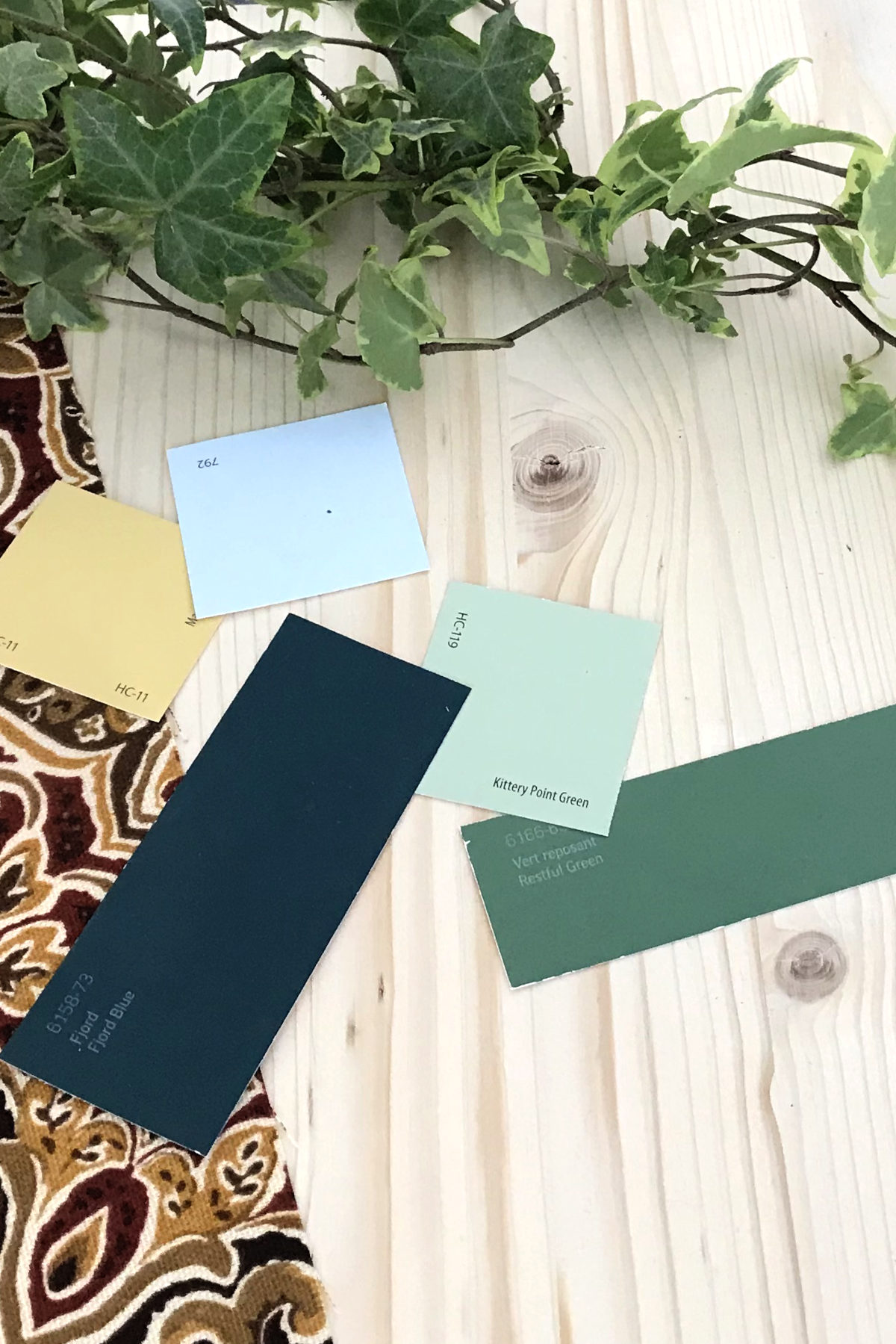
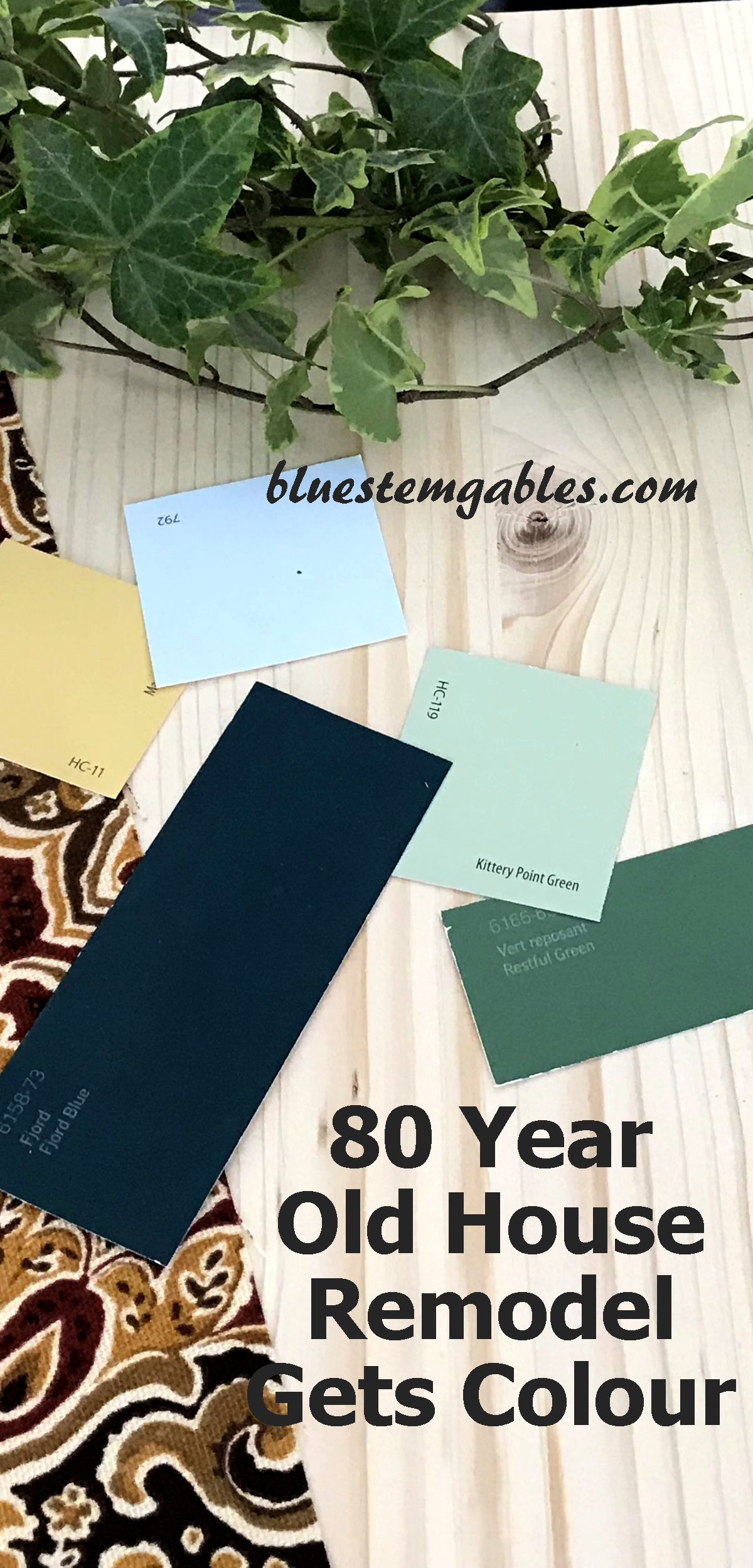
Maybe old habits die hard, or the old known is a comfort, or maybe it’s just a good colour, but I painted the addition mossy sage green. It has less brown tones than my old living room, which looks pretty brown in certain light. (or maybe it is partly because the paint is getting old, too!) It is Benjamin Moore’s Kittery Point Green.
Of course, it is from the Historical Collection. That is one way of keeping me in check, at least. Kittery Point probably won’t ever be the colour of the year because its name isn’t very romantic, but I kept coming back to it from among my pile of paint chips. It is saturated enough not to appear a whitish in any light and just a hint of brown so as not to appear minty.
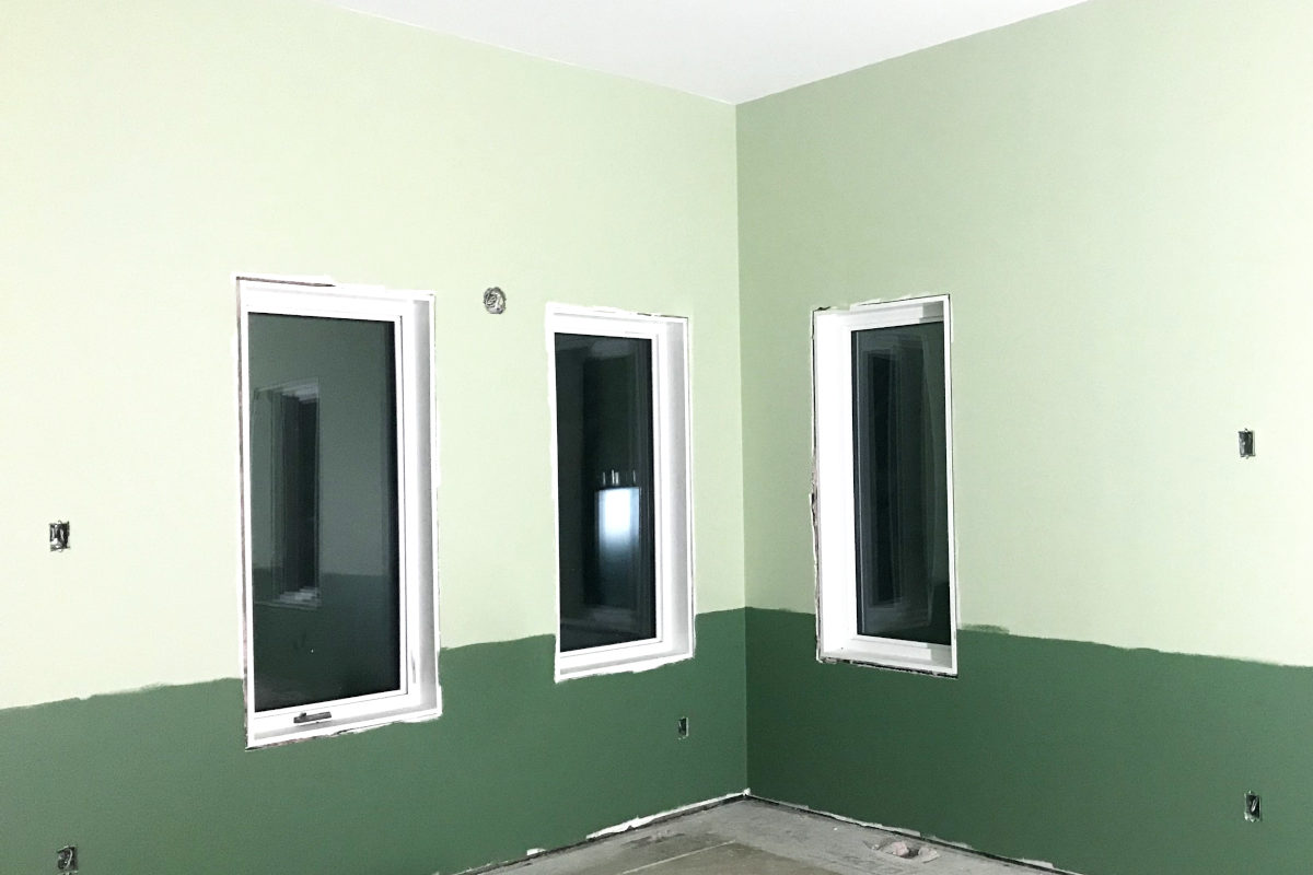
But speaking of light, this colour changes a lot from morning to evening, with all our natural light! It is quite springy and bright sage on a sunny morning, but in the evening or if it is overcast outside, it can be quite muted, and more of a light moss. To be honest, I was going for more of the light moss.
I also had visions of grounding the moss green with a darker green wainscoting. I chose Sico’s Restful Green. It is a hunter green with a hint of grey. It is not the darkest shade on the paint swatch because I didn’t want it to appear blackish in the evening. Don’t forget, night starts at 4:30 in the winter season in this part of the world.
A few years ago I painted an entertainment unit black that I converted into a homeschool cabinet. It is very striking and handsome, with the stained oak top, but for me, I found it rather shocking. So no white, and no (well, not too much) black.
McMunn and Yates stocks Sico paint, so that is what we used. I actually like it quite a bit. It is not splattery like cheap paint, but it is not so thick (Like Benjamin Moore has gotten – ask my professional painting relatives) that you lose coverage in square footage.
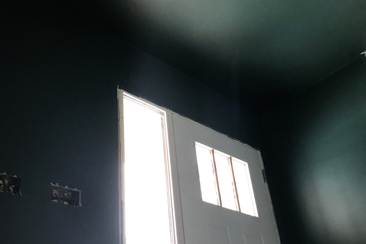
I did want dark paint in one small area. That is the entrance. All the walls and ceiling are covered in Sico’s Fjord Blue.
I painted my wood floor a few years ago. (Gasp, I know, but some of the nails were starting to show so it couldn’t be sanded down anymore for varnishing.) That floor is a slate blue, and exactly what I was going for.
So for the new entrance, Fjord Blue is very similar to the old floor, with a dose of green to blend in with the other greens, for a dark green-grey teal. The dark ceiling encloses the area to start that cozy feeling I wanted for the new entrance.
Now, I have always been a fan of blue, and I have confused my sister with all this green. But, yet another colour, I painted the pantry a very light true blue – Benjamin Moore’s Mystical Blue. It is lighter than other blues I have worked with. In bright light it looks almost white. But my pantry does not have lights yet, and most of the time Mystical Blue looks quite bright. Eek! Trusting the lighting will tone it down. I want to do this colour in a few small rooms in the old house.
Way back, I actually did consider blue, and robin’s egg blue for the main area. But I did some experimenting in my bathroom, and in some of our rental suites with Sherwin and William’s Sea Salt. A blogger I sometimes follow is in love with this colour, but I only love it in the evening, when it looks like a true blue. I do not live by the sea, and cannot do turquoise.
I haven’t even mentioned the muted golden yellow doors, which I haven’t painted yet (Benjamin Moore’s Marblehead Gold), or the splash of brick red in a flower pot, dish towel or Annie Jackson dried pole beans.
It seems almost unfair to reveal the progress at this point because I want to show you the finished product and how it all ties together. All the bits and pieces of finishing might seem disjointed when they are by themselves, but I do have a picture in my mind. I am envisioning rich historical colours that are calming, yet invigorating – like peppermint tea.
Stay tuned for a kitchen update, and then to see how the finishing elements come together in our old house remodel and addition! Till next time…
You might like these other editions of this Dear Old House Remodel:
80 Year Old House Remodel 6 – Floor Plan
80 Year Old House Remodel 2 – Demolition
 I'm Erika, I live on eighty acres in the northern prairies of southern Manitoba with my husband and four kids. Here, we enjoy the outdoors and try to be more self sufficient as we try new things in the garden and learn about our land and the world around us.
Leave a Reply